
A well-crafted contact form is worth more than gold in the world of digital marketing. It’s often the result of a beautiful symbiotic relationship, a team effort between search engine optimizers (who know what the site’s users have been looking for), and graphic designers (who know how to attract those users visually). Pulley Media is currently researching contact form designs, to re-do our own. In the process, we’ve scoured the web to bring you the very best of attractive, creative contact form design to convert a click to a lead.
Top 10 Contact Form Designs for 2016
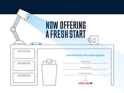
This form is intended to go in the footer of a site, though it could just as easily go on a traditional Contact Us page. The clean lines coupled with the coffee reinforce the words “fresh” and “bold”.
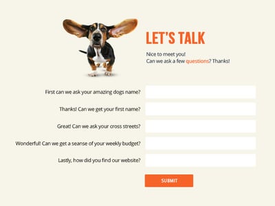
Who can resist a cute pup? The basset hound, bold orange tone, and the personal questions in the contact form are attention grabbing – all meant to encourage a customer to want to share more about themselves.
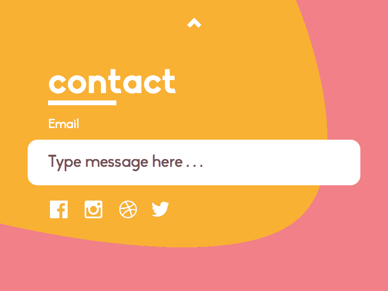
Sometimes, less is more. Offering customers a way to get in touch, without giving away too much, is perfect. The bright, friendly colors surrounding the input field assure that your eyes focus directly where the graphic designer intended.
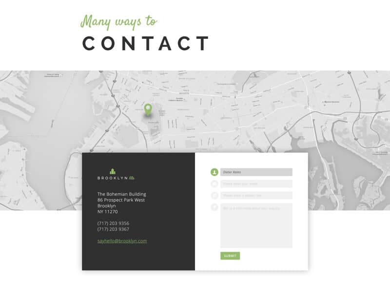
For a local business with a physical location, a map is always appreciated. This design offers professional black and white tones, presents multiple ways of getting in touch, and has all of the traditional contact form fields.
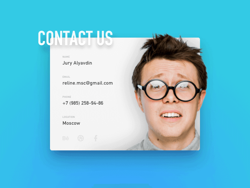
It’s bright, it’s eye-catching, and the photo is filled with personality. Between the photograph, the excellent use of blank space, and the colors – this was a form designed with a thoughtful eye.
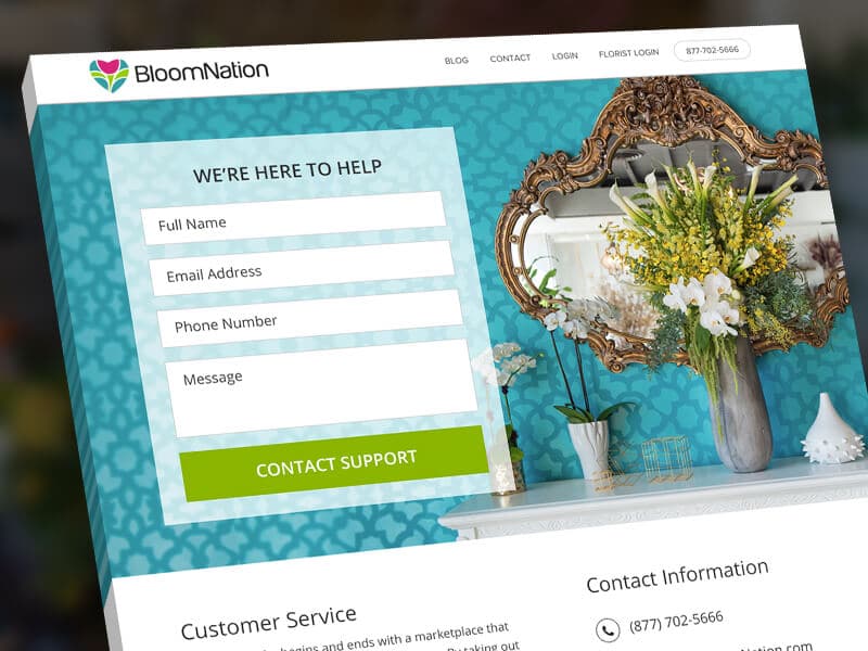
The beautiful thing about this contact form, is that it’s above the fold. This means that it lies just above the point where a person has to scroll to see it. While more contact information is provided later in the page, the eye is immediately drawn to the form with the use of color, and an attractive photo.
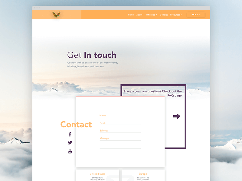
The choice of colors, background design, and geometric shapes create a graphic design that’s eye-catching and instills trust. As an added bonus, the customer is encouraged to check out the FAQs, with an attractive pop of purple from behind the main form.
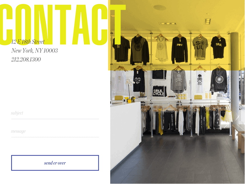
The graphic design for this retail store’s contact form showcases the store, reinforces the brand, and gets right to the point. With only two fields, it’s easy to get right in touch. The bold yellow color pulls the eye right in.
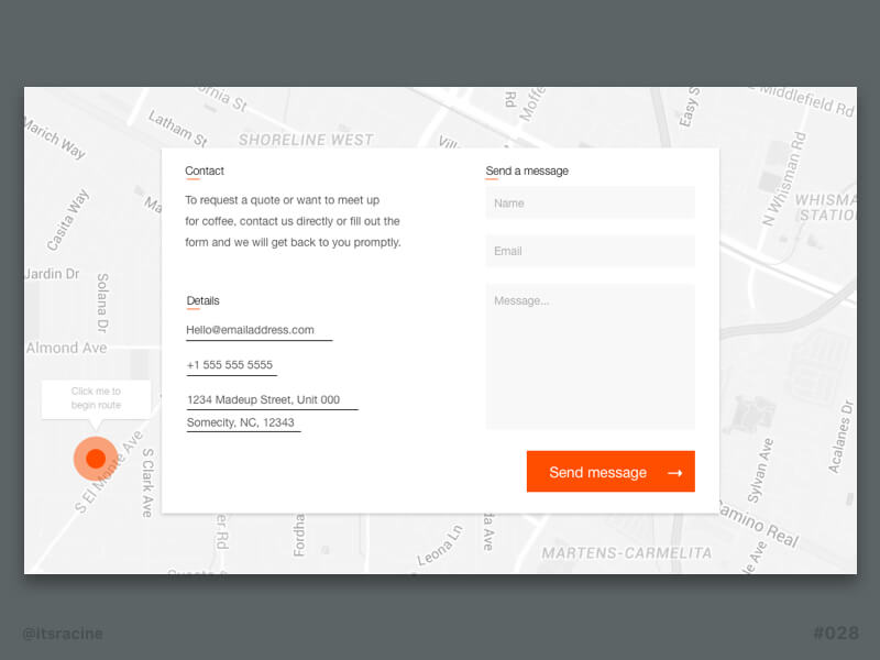
Immediately reminiscent of a postcard, this design just feels friendly. The map marker is helpful, and the content “want to meet up for coffee” is a casual way of inviting users to enter their information in a noncommittal way.
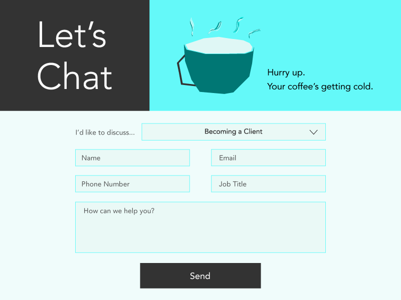
This contact form design asks for basic information, for a quick chat. The high level of contrast with the blue and black colors pulls your eye to “Let’s Chat” and “Hurry up. Your coffee’s getting cold.” There’s a playful sense of urgency.
[…] schools choose to use an inquiry form in order to download their content offer. This creates the first contact for prospective families […]